User Activity Overview
This dashboard provides a comprehensive overview of user activity in the system. Dashboard user gains information about the number of sessions initiated by users of Uptempo platform, login success rate, average number of platform users per day as well as user adoption expressed as percentage of registered users that actively logged in.
In addition, this dashboard also provides insights into number of logins and sessions by various dimensions that can be selected by dashboard users, user activity by organizational unit as well as geographic distribution of Uptempo platform users.
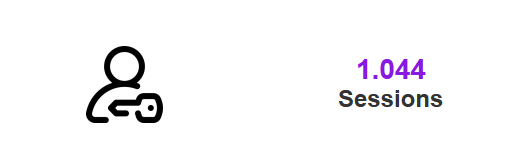
Displays the total number of logins and log in attempts in the system and selected time period. Note that the total number also includes logins with errors (if any).
Calculation: Distinct count of sessions with event type Login or Login Error.
Insights
The number of sessions provides information on how actively users use the platform. A high number could indicate intensive use.
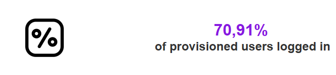
Shows the percentage of total provisioned users that logged in at least once into Uptempo platform.
Calculation: Distinct count logged in users / distinct count of all users provisioned in the system.
Insights
This metric provides users with insights into the success rate of logins by comparing successful login events total number of login attempts. A higher percentage may indicate better user experience accessing the platform.
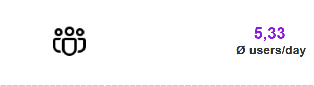
Displays an average number of logged in users per day.
Calculation: Average of count of logged in unique user ids per (session) date within selected date range.
Note
Only events with the type Login are considered for this metric.
Insights
This KPI![]() A measurable value that demonstrates how effectively a company is achieving key business objectives (Key Performance Indicator). provides insights regarding the volume of users using the system.
A measurable value that demonstrates how effectively a company is achieving key business objectives (Key Performance Indicator). provides insights regarding the volume of users using the system.
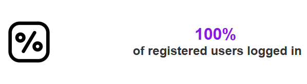
Shows the ratio of registered users that actually logged into the system at least once in relation to total number of registered users.
Calculation: Count if users with Login event / Count of users with Registered event
Note
Only reviews with a set due date are considered for this metric.
Insights
The metric provides insights into adoption of the platform by comparing the number of users who actually logged in to the number of users registered.
This chart displays the number of users and corresponding sessions. The visualization considers logins within the date range specified. This is a dynamic view where the user can change the slicing dimension using the “Slice by“ parameter. Changing values of this parameter not only modifies the slicing dimension in the visual along its title, but also the available values in the linked “Breakdown Filter” filter. Possible values for the slicing dimension are:
-
Organization Unit
-
User Name
-
User Role
-
Module
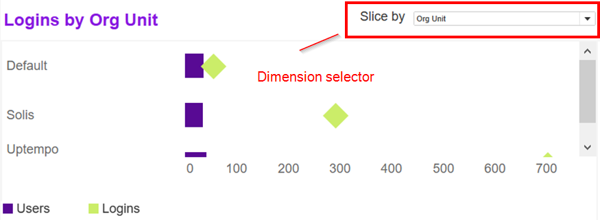
Filter action
Selecting a row or data point in this visual will trigger a filter action and will filter all remaining visuals in dashboard for the selected entry. Clicking again into the selection will reset the filter.
Description
This visualization provides information about the number of users by organizational unit that have logged into the system within selected dates. It also shows the percentage of these users, that have been active since the date specified by the “Logins since” selector:
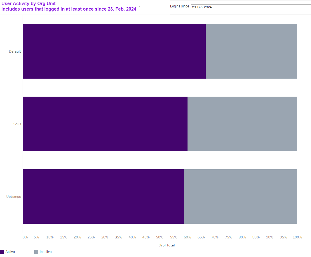
Calculation
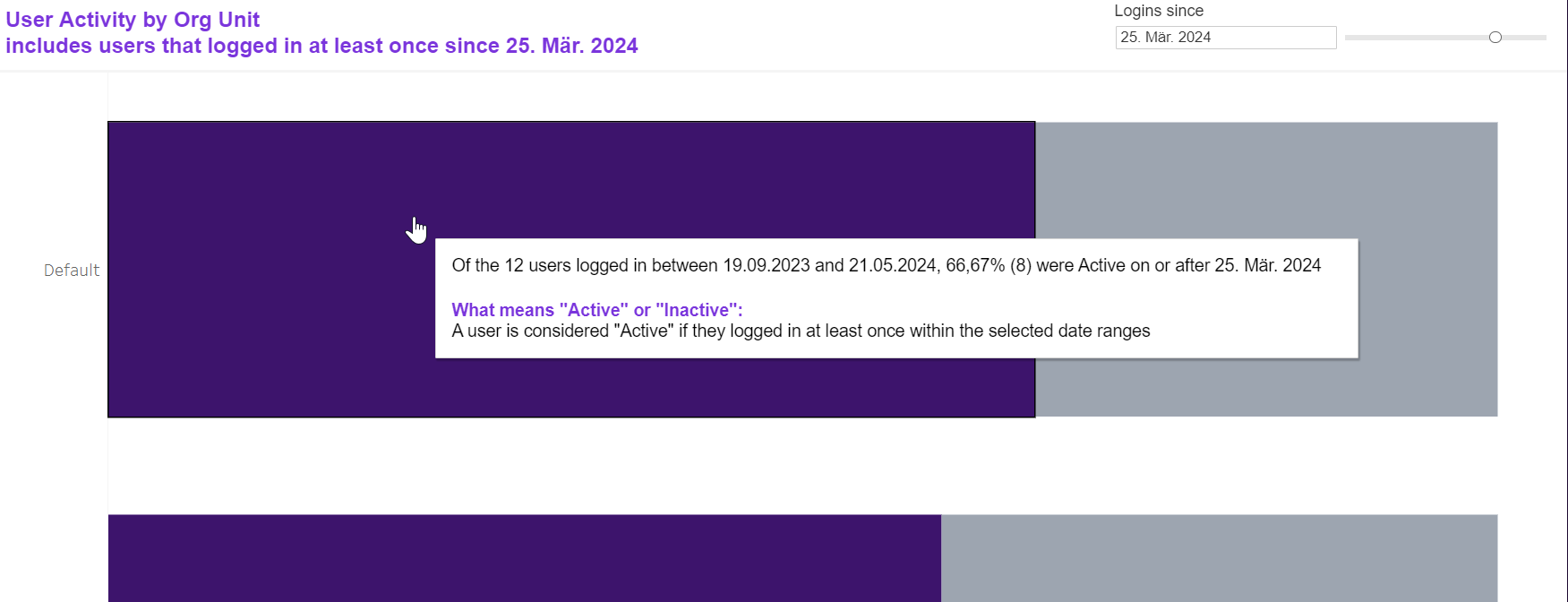
First, the system calculates number of users that have logged in selected time range. Then, from those users all users that have logged in on or after the selected date will be highlighted as active, the others as inactive. This is also explained in the corresponding tooltip:
Filter Action
-
Click on the corresponding segment of the chart to filter all visualizations in the dashboard for the underlying organizational unit.
-
Click on the same segment again to reset the filter action.
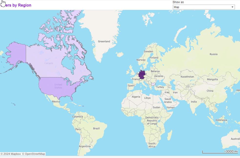
This chart provides users with an immediate and comprehensive overview of the geographical distribution of users on the Uptempo platform. The chart can be viewed either as map or as a bar chart, simply by choosing the corresponding value from the Show as selector.
The darker the shading of the color the more users have logged in into the Uptempo platform from the country in question.
In the map view, users can
-
Zoom in or out of the map
-
Move the map
-
Click the (highlighted) entries to filter the dashboard for current country
Note
In the map view, users with no region or country configured are excluded.