Tables
Elena needs to collect data regularly in the workflow steps assigned to her. She noticed that sometimes the table doesn’t look like a classic Excel data sheet, but it does with other data sheet layouts.
Depending on the data to be collected and displayed, the users of the Jobs module can work with two types of tables. The available tables allow an efficient and clearly organized entry of data.
Tables are needed to capture and display a wealth of interrelated data in a structured, clear way. Both advanced grids and comfort grids can be used on the job data sheet. In the following section, you will find out how the two differ.
 Advanced Grid
This type of table allows for a highly differentiated collection of data and data types. These include text, assets, dates, relations, and multi-select. You can also display extensive tables of this type with pagination.
Unlike Excel, the initial table does not display an empty workbook. You can recognize the extended table by clicking on Add Entry: In an extended table, the fields to be edited open one after the other. Only after you have saved your entries will the data be displayed in a table.
If an extended table is added to the data sheet of a sub-job, it can be configured to be pre-filled by a table from the parent job. In the sub-job, you can edit the pre-filled table and delete and add records. If this child table differs from the parent table, you will see a refresh button. If you click on the refresh button, the table is overwritten again with the current values from the parent table; your unsaved changes are permanently lost.
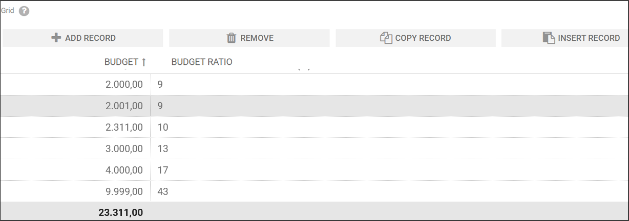
Comfort Grid
The comfort grid allows you to enter fewer types of data than the extended table: text, number, date, and single-selects. This type of table still remains visible while entering or editing an entry. Date and number values can be displayed and entered according to the selected interface language. Predefined formulas can be processed by filling in the fields, with the calculated result displayed in a result column or in the footer.
There are numerous keyboard shortcuts to aid in the editing process:
-
Use the button above the table to add as many lines as you want. Selected lines can also be removed by clicking on the button with the trash icon.
Note: The lines are removed immediately with no confirmation dialog box. -
You can activate edit mode by double-clicking on a cell.
-
If a cell is in edit mode, you can use the
 (Tab) key to move to the next cell – then also in edit mode. Press the key in the last cell of the table to add a new line.
 -
Numeric fields: The value is increased by pressing the ↑-/↓ keys. In addition, numbers can also be entered via the numeric field.
-
Date fields: Press the ↓ key in edit mode to open a date picker. Use the ↑-/↓ and →-/← keys to select a date. Press the ⏎ key to adopt the date.
A date can also be entered via the text field.
-
Use the button or the keyboard shortcut CTRL-C / CMD-C to copy the contents of the selected line.
-
Use the button or the keyboard shortcut CTRL-V / CMD-V to paste the previously copied content back into the line below the selected data record.
-
Hold down the SHIFT key and click on the first and last line to select a range of data records that you can then remove or copy using the corresponding buttons. By holding down the CTRL or CMD key, you can selectively click on several individual records and select them for further editing.
-
Clicking on a column header will sort the contents of that column. Click again to sort in reverse order.
The comfort grid displays columns automatically based on the administrator's layout, ensuring a consistent and optimized viewing experience.

Note
If your administrator has not specified column widths in the data sheet layout, custom widths are not applied. In this case, the grid will use the default.
You can use the  button to activate the view of the table in full-screen mode. In this mode, you will only see the table on the data sheet and will rarely have to scroll through the data.
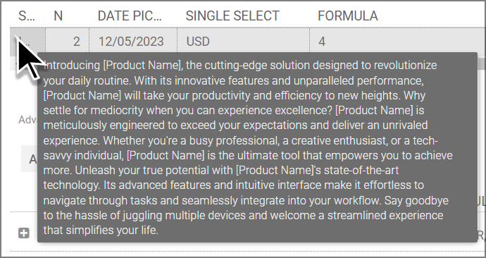
If the content of a cell cannot be displayed completely, place the cursor above the cell. The content is then displayed in a tooltip. This also applies to cells in the header.
When the grid content exceeds the visible area or container width, a horizontal scrollbar will automatically appear at the bottom of the grid. This scrollbar allows you to easily scroll left and right to access any columns or content that extend beyond the viewable area.