General Information
This chapter gives you basic information about the module Home.
 Boards
The module Home consists of boards. When you reach the module, you can see public and shared boards. You select a board from the drop-down list in the upper right corner:
The drop-down list can be divided into up to three sections:
-
Administrator boards: These boards are created by administrators, shared with a specific user and can be only modified by administrators.
-
My Boards: You will see this area if you have created at least one board of your own. You can tell if you can create your own boards by the fact that Create Board is displayed in the drop-down list at the top.
-
Published boards: You can see this area if at least one other user has created their own board and shared it with you or published it for all users.
Whether you can additionally share or publish your own boards depends on your permission.
Grid
When you edit a board, the page is displayed in a grid.
The grid divides the page horizontally into 24 segments. Vertically, the page can be any length. The grid determines in which size and position an element of the page is displayed. The elements are inserted as so-called widgets. Note that the grid behaves dynamically: When the browser window is reduced or enlarged, or the sidebar is displayed, the horizontal division is adjusted so that the division into 24 segments is preserved.
Widgets
Widgets are elements that you can insert on a board. The following widgets are available:
-
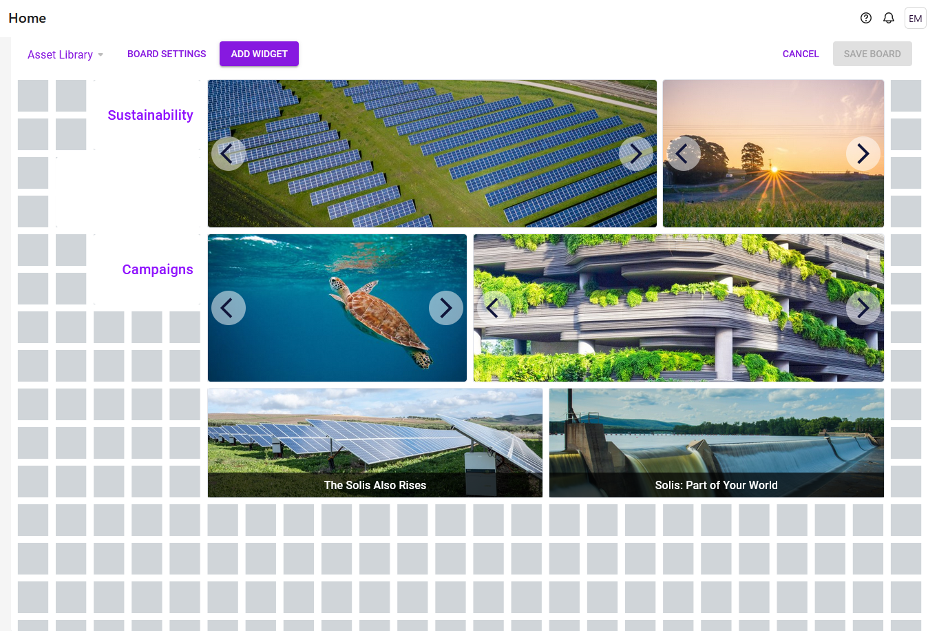
Asset Carousel: The carousel widget can be used to display several images as in one slider.
-
Link: The link widget allows a board to link to other pages, for example, to other boards in the module or other modules that offer linkable content, for example, assets in the Media Pool.
-
: The link carousel allows to provide multiple links in one carousel. Each link is represented by an image; the user opens the link by clicking on the image. The selection of the different links is done as with the asset carousel. The settings are the same as for the Link widget.
-
: With the placeholder you design the positioning of the widgets by inserting white space on the board. Especially when automatic vertical alignment is enabled, you can use the placeholder to influence the design of the board. The widget has no settings. Position it and drag it to the desired size.
-
Fusion UX Logic: The widget allows to configure home screens according to specific needs. You can now embed web components into dashboards. This accesses the existing Fusion UX web component configuration.
-
Reports: The widget allows you to display reports in a dashboard.
-
Rich Text Editor: Use this widget to insert information such as formatted text, images, tables and special characters into a board.
-
Review Manager: With the widget, users can create their own customized dashboards for reviews. Reviews can be displayed in various statuses for each role (owner, reviewer, guest and uploader). This allows users to see only relevant reviews.
-
Search: This widget enables a direct search query in the five modules Media Pool (Assets), Marketing Data Hub, Job Manager (Jobs), Brand Templates and Shop.
-
To-Do List: The To Do List widget shows tasks and jobs of the user from the Job Manager.
-
Text: The text widget is used to integrate simple text into the board, for example to group widgets. Widget texts can be included in multiple languages.
-
Twitter (X): The Twitter widget allows the user to add a Twitter (X) feed to the board.
-
Video: With this widget, the user embeds a video from the Media Pool into the board.
-
YouTube: With the widget, the user integrates a YouTube video into the board.